"… as far as possible from the white box", Jean-Louis Deniot

We deeply admire the work of architect/interior designer Jean Louis Deniot and constantly draw inspiration from his interiors. His rooms exude simplicity, elegance and sophistication. At a first glance his design work seems effortless, as he himself sustains is his intention. It is upon deeper analysis that the complexity of his interior design plan comes to view. Every single detail from the architectural design to the decoration has its own place and a reason for being there. His interiors are timeless, full of historical references, and always harmonious.

His floor plans strive to achieve not only a beautiful space but a functional one in which the client's comfort and life style are taken into account. Note the amount of lighting in the room and its placement, the comfortable sitting furniture with tables located for easy reach and the feeling of easy flow and movement around the room.

One of our favorite characteristics of his work is the unique way in which he introduces the element of the unexpected while maintaining a harmonious effect. In these examples, the placement of the art and mirror are not conventional or symmetrical. Rather, he creates balance and harmony through the combination of the other objects in the  room .


Best-Design-Books-Jean-Louis-Deniot-Interiors2.jpg


We love Deniot's references to history and the depth that these references give to his work. He mixes historical inspiration with contemporary and modern elements creating a link between the past and the present. 

                                                                      &nbs…

                                                                                   Syon House (1760) by Neoclassical architect and designer Robert Adams

In this room Deniot takes Adam's concept of replicating the designs of the ceiling on the carpet and gives it a modern take. He simplifies the geometrical forms and opts for a monochromatic neutral palate in contrast to the colorful and more ornate style used by Adams. The simplicity of the geometrical forms and of the color scheme highlights the beauty of the idea of the ceiling being reflected on the floors, thus retaining the strength of the original concept. He creates a link to the past, not a recreation of a historical period. 

Something Old, Something New...


Part of our job is to incorporate furniture owned by our clients into the new design that we are creating for them. These pieces tell the clients' stories and also express their taste. The challenge of integrating and mixing them with new pieces and into a new design concept is one that we enjoy taking. We love seeing the transformation that a different fabric or even a trim brings to a chair or sofa, and how the same piece of furniture can bring a different aesthetic experience, depending on its placement in a room


Changing the floral fabric for a suit-like one, give the chairs a more tailored and modern look.

Before

                                                                      &nbs…


After


Chairs in the work room waiting to be delivered!


Reupholstering the stools in a more striking and sophisticated fabric gave us the oportunity to place them in a more prominent location in the living room and to connect them to the art work.

Before


After


In the following project, our clients were moving to a bigger space and wanted to create a room with two sitting areas instead of one. They also wanted to use some of the furniture they had, add grays and blues to the color palette, and achieve a more sophisticated look that would add some spark to their space.

Before

                                                                      &nbs…


With these objectives in mind, we chose a chaise lounge in a rich blue velvet as a statement piece.

After

We reupholstered their sofa in a light gray fabric and their stools in the same fabric we used for new side chairs that we chose for the secondary sitting area. We placed the black coffee table from their previous apartment in between these chairs and in front of a new love seat. To introduce different materials and add luminosity, we selected an antiqued-mirror-top cocktail table and black quartz table lamps with grey silk lampshades for the main sitting area . 

After


Living With Art

Art not only brings beauty to a room, in most cases it also expresses the owner's taste and personality. Individual taste and personality are two qualities we like to incorporate in our design since we believe in creating interiors that represent the uniqueness of each client. Planning how and where to position your art in relationship with the rest of the room will ensure that you highlight it and maximize its experience. 

Frank Lloyd Wright. Hollyhock House, Los Angeles, 1921

                                                                      &nbs…


Frank Lloyd Wright experimented with the concept of integrating nature and architecture throughout his career. In this living room he uses art to bring nature into the indoors. The colors in the Japanese landscape screens complement the organic tones of the wood work, at the same time that they introduce a natural element to the inside. The art in this room is integrated, not only at an aesthetic level, but at a conceptual one as well.

 D. Ventura Rodriguez. Palacio de Liria, Madrid, Spain. 1773

                                                                      &nbs…


The rich red fabric used to upholster the walls creates a perfect background to highlight the works of art. The gold frames, the gold color furniture, together with the red walls, lighten the dark background paintings and drive our attention to them.  

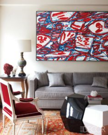
Robert Couturier. Living room with Jean Dubuffet painting    

                                                                      &nbs…


Couturier uses red and white furniture and decorative elements in a contrasting manner in order to integrate the Dubuffet painting within the decor, thus guiding our attention to it.


Our Approach


IMG_3499 - Version 2.JPG

Creating drama through contrast 

Responding to the dramatic and strong contrast inherent in the main painting in this room, we decided to take an approach based on a play of contrasts. To highlight the art and create contrast in the room, we painted the back wall in dark gray and the rest of the room in white. We placed the light color table over a dark floor covering and decorated it with mostly black books. To bring luminosity and also strength to the dramatic effect created, we added a bronze sculpture and silver and glass decorative objects.  


IMG_3398 - Version 3.JPG

Unexpected

In this case we thought that an interesting way of highlighting this contemporary painting would be to place it over an antique bench. We wanted an unexpected but harmonious effect. With this in mind, we framed the painting in an antique traditional frame that relates to the wood and gold tones of the bench. We chose a solid fabric in the most neutral color found in the painting, and added white modern accessories to further integrate the art work within the decor. 


Playing with optical illusions: Where does the room end?


 Inspiration


Neutra.jpg

                                            Desert House by Richard Neutra.  California, United States, 1946 

The use of the large glass walls erases the physical boundaries of the space integrating the outdoors and the indoors


Hall of Mirrors, Palace of Versailles by Jules Hardouin-Mansart and Charles LeBrun. France, 1678

Each of the seventeen mirrors is aligned with a window reflecting the view of the outdoors and visually expanding the space

Trompe l'oeil fresco by Paolo Veronese in Villa Barbaro by architect Andrea Palladio. Italy, 1557-58

The decorative paintings on the walls using the trompe l'oeil  technique creates the illusion of the existence of another space


One effect we like to include in our projects is the feeling that a room doesn't end within its walls.  Influenced by a long standing tradition, we like to evoke the sensation that a room expands and erases the physical boundaries in which it is contained.

In the following example we achieved this sensation through the placement of art and mirrors.

Entering this foyer from the front door (last door to the left) there is more space to the right where the public areas of the apartment are located, than to the left which leads to the private spaces. 

In an attempt to balance the space and play with the idea of expanding the room, we chose a photograph that  emphasizes depth and perspective. 

In the wall opposite to the front door we hung two large mirrors which give depth and amplify the space by reflecting its different areas.  

1185_ParkAve_9A_fyr2.jpg

 Final result

The perspective of the photograph gives the impression that the foyer keeps going into the space of the photograph itself and the mirrors reflect different areas giving depth and amplifying the space.